These are my four themed choice images based off of ideas I have gotten from my art trading cards that we made in class a couple of weeks ago. 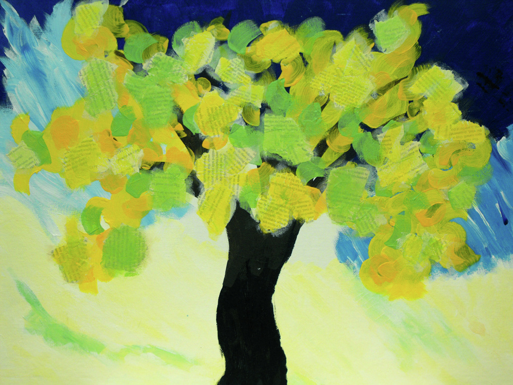 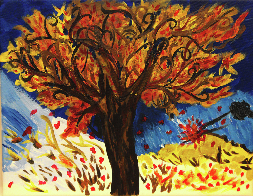 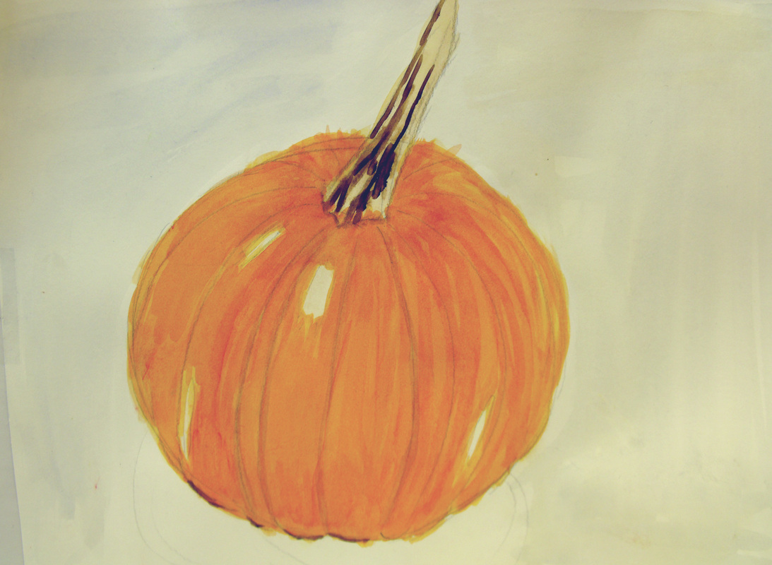 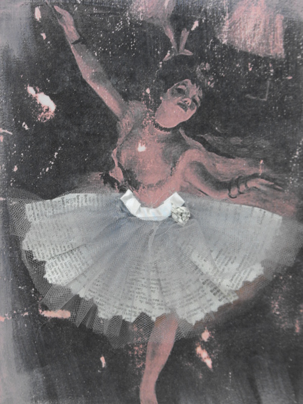
0 Comments
I was absent from school today so I wasnt able to get my canvas from school to finish it so I did a different project instead to turn in for the deadline tomorrow, I figured I could just use my painting for another project. I will upload pictures this weekend
I have been working on my acrylic painting on a large canvas for the past week using my trading cards and some that I got from other classmates to help me choose what I paint. I am painting a tree painting by Van Gogh. I hope to have it done by next week sometime
we're just working on a new project in class. we are making trading cards to trade with classmates to help us choose our themes for our presentation at the end of the semester as well as to give us ideas for our next project.
Just checking back in, I've been working on my face sketches over the past week, once im done doing my light sketch im going to start using water color to finish the project. Im going to upload all of my finished projects with descriptions today! Check back in later this week and I should hopefully be finished with my face water color!
~Megan Hello,
Just checking back in! We just started working on a new project on monday. We are learning how to sketch skulls. We carried on the same assignment today, we mostly just used one point perspective to make realistic sketches of the skulls based on what angle we were looking at them from. Thats the only new news I have thus far, if anything new and exciting comes up later in the week I 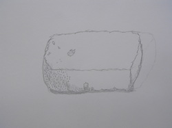 This is my value drawing. The point of this assignment was to use techniques such as cross hatching and stippling to make lines and define the planes without drawing actual lines. This sketch uses values as opposed to outlines. I drew a sponge. It was a good choice for my value sketch because there were many concentrated areas of texture that allowed me to use a lot of stippling and crosshatching. Do a drawing that models a three-dimensional form on a two-dimensional plane that uses values not outlines. Remember we can make values of lines and texture by use of parallel lines (they will curve to define the plane) cross-hatching and stippling. That is all there is! Plese do not smuge! 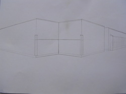 This is my two point perspective drawing of a hallway. I drew the corner hallway outside the art room. Two point perspective was more challenging than one point because you had to focus on two vanishing points as opposed to one. I think the over all finished project turned out well. The angles are all good and I made sure to base all of my lines off of the correct vanishing points. 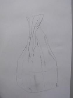 Thsi is My texture drawing. I sketched a paper bag and focused on the wrinkles and contours to give it a textured look. The bag had a lot o wrinkles and texture to it so it was a good choice to draw for my texture assignment. My favorite part is the top of the bag because there were a lot of wrinkles which gives the drawing more detail. This is a post with all my latest sketches including my texture sketch, my two point perspective, and my value drawing. Check back in next monday for updates. Thank you.
~megan 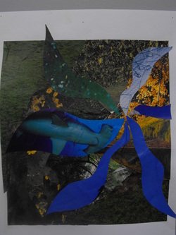 This is my collage using adjacent colors on the color wheel (blue, yellow and green). It shows a lot of texture and depth through the shapes of the different colored papers and the textures and patterns on the paper. There is subtle foreground and background, the brighter and lighter shapes are in the foreground while the heavier and darker shapes are in the background. 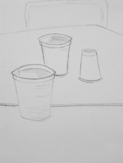 This is my first scale drawing. It shows depth and shading through the placement of the cups on the table and the shading in different places to create the illusion of shadows. These different factors from the sketch make the drawing look somewhat three dimensional. 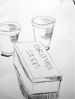 This is my second scale drawing. I sketched a set of cups and a box of graphite sticks to show depth and dimension. The placement of the cups and the box create a sense of depth while the shading and the shapes of the objects make the drawing look somewhat three dimensional. This is my second blog post,
attached are up to date photos of my most recent finished projects from Advanced Art. These projects include two sketches of real objects showing depth from the positioning of the objects in my drawings, my color wheel collage using blue, green and yellow, and my straight line painting based on the works of Winslow Homer. My next project is a one point perspective drawing, i will be working on that for the remainder of the week and will post a picture of my finished project towards the end of the week. Today is Sunday September 12th, 2010. I just finished up creating my collage, which was our first project in class for the year. I stuck to three similar colors in my collage; blue, green and yellow. I like this piece because it has a lot of texture and creates the illusion of depth. Our next project to be started on monday is a sketch of real objects you see put into correct perspective. Other than that i dont have anything else to report, check back within the next coup | AuthorWrite something about yourself. No need to be fancy, just an overview. ArchivesDecember 2010 Categories |
 RSS Feed